
Every blog post we published this year shipped with a secret passenger: a hand-rolled <style> block, eighty-odd inline styles, and a prayer that light mode would forgive us. It never did. So we rebuilt the theme instead — and turned two years of publishing pain into a post kit anyone can use.
Build-in-public diary, companion to our automated publishing pipeline — the machine this content rides on.
theme.json
Gutenberg Patterns
PHP
TL;DR
- Theme v2.1.0 kills per-post CSS: 11 native classes and patterns replace every
<style>block and inline hack. - Real bugs fixed along the way — illegible light-mode code, dead table CSS, a ghost accent variable, and images you couldn’t click to enlarge.
- All 30 published posts migrated with machine-checked proof that not a single reader-visible word changed.
- Posting is now content-only: pick a pattern, write words, publish.
What You’ll Learn
What Broke
Invalid CSS, invisible glass, and black-on-dark code — found with screenshots.
The Post Kit
Native classes and 11 Gutenberg patterns that end hand-rolled markup.
Safe Migration
How 30 posts moved with text-parity proofs and zero-downtime deploys.
The Pain: Death by a Thousand Inline Styles
It started innocently. The theme’s glass surfaces rendered nearly invisible, so one post got a small <style> override. Then every post copied it. Then the CTA needed buttons, the TL;DR needed a tint, the learn grid needed tiles — each with its own inline CSS, tuned by trial and error in two modes. By September, a typical post carried eighty-plus inline styles and a bespoke stylesheet, and authors needed a CSS cheat sheet to publish a paragraph.
The screenshots told the story: code blocks with black text on dark slate in light mode, TL;DR cards rendering as empty navy voids in dark mode, tables flatter than designed. Each bug had been papered over per post instead of fixed once in the theme.
Lesson: Workarounds Compound
One override is pragmatic. Thirty copies is a second, shadow theme living inside your content — unversioned, untested, and load-bearing. The moment we counted them, the rebuild became inevitable.
The Audit: Six Bugs With Receipts
Before writing a line of theme code, we audited the live site in both modes with scripted screenshots and read the theme source. The findings:
| Bug | Symptom | Root Cause |
|---|---|---|
| Illegible light-mode code | Black text on dark slate | pre had a fixed dark background with no text color and no light override |
| Dead table rules | Flat headers, no striping | rgba() wrapped around hex variables — invalid CSS, silently dropped |
| Ghost accent variable | Customizer color picker dead in light mode | Light rule referenced --theme-accent-color, which nothing defined |
| Dead glass defaults | Cards invisible in both modes | 0.03 dark / 0.25 light opacities nobody could use |
| Unclickable images | enlargement needed right-click | Custom-HTML figures bypass core lightbox; theme added no fallback |
| Editor blindness | Authors couldn’t see what readers see | 40-line editor stylesheet knew none of the post classes |
Every one of these was a one-line to ten-line theme fix. Collectively they had cost months of per-post workarounds.
The Post Kit: Content In, Patterns Picked, Publish
The fix is a contract: posts contain content only — no <style>, no inline CSS, ever. Everything recurring is a native class or a Gutenberg pattern:
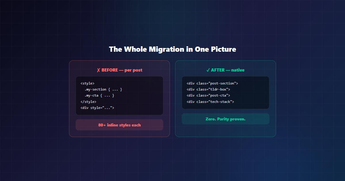
- Sections, CTAs, TL;DRs, lessons, pills, grids — one class each, per-mode correct by construction.
- 11 block patterns including a post funnel (CTA + related reading in one insert).
- Accent color, glass intensity, blur, and radius in the Customizer — no-code control for non-developers.
- Native image lightbox covering plain images too, and Prism.js removed since nothing used it.
By the Numbers
The whole project, measured:
| Metric | Value |
|---|---|
| Published posts migrated | 30 (+ 4 drafts) |
| Gutenberg patterns shipped | 11 |
| Correctness bugs fixed | 6 (code, tables, accent, glass, lightbox, editor) |
| Per-post style blocks remaining | 0 |
| Reader-visible words changed | 0 — every push parity-proven |
| CDN assets removed | 3 (Prism CSS, core, autoloader) |
What Readers Actually Notice
Readers never see the class names — they feel the difference:
- Code you can read in light mode — the single most-reported annoyance, gone.
- Images that enlarge on click — diagrams finally inspectable without right-click gymnastics.
- Lighter pages — three unused CDN assets gone and no dead CSS fighting the cascade.
- Tables with real headers and striping — comparison content scans the way it was designed to.
- A Customizer accent picker that works in both modes — small thing, visible everywhere.
Migration at Scale: Trust, but Verify by Machine
Thirty published posts plus four drafts moved to the new classes. The rule that made it safe: every push had to prove, by string comparison, that zero reader-visible text changed. Structural edits that failed the proof aborted before touching the database — which caught real bugs, including a regex that once ate an entire article body (restored from revisions in minutes).
Known exceptions were documented, not hidden: working image carousels, data-colored verdict tables, a background-image hero, and hand-highlighted code keep their styling until native equivalents exist. The standard holds everywhere else.
Lesson: Guards Beat Skill
No amount of careful regex beats a parity check that refuses to push. Every migration script in this project ended with the same two lines: prove the text identical, prove no legacy markup remains. Boring automation; zero incidents that reached readers.
Built for the Modern Editor
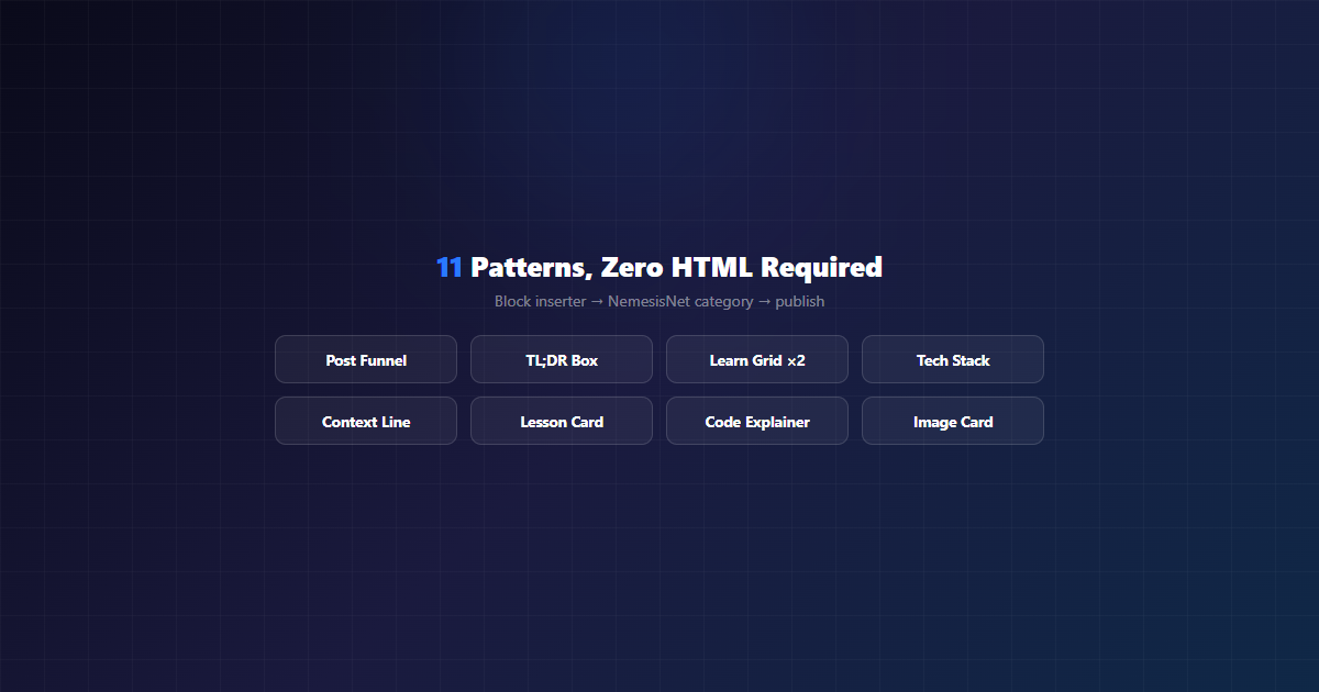
The post kit isn’t a snippet library — it’s wired into the editor itself. Eleven block patterns ship in the NemesisNet category, so authors insert a funnel, a TL;DR box, or a learn grid without touching HTML at all. Underneath, theme.json v2 carries the brand palette (locked, so off-brand colors are impossible), appearanceTools for per-block spacing and duotone control, and layout sizes that killed every hand-rolled container width.
The quiet win is editor parity: the editing canvas now loads the same component styles readers see. Authors finally see the card they’re building — after a year of the editor showing unstyled boxes, that alone changed the writing experience.
AI-Native Out of the Box: llms.txt
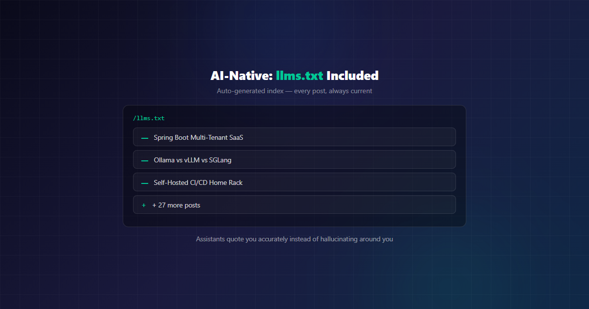
Every v2.1.0 install auto-generates llms.txt — a machine-readable index of the site with every post and page linked and excerpted, managed through an admin screen. No build step, no plugin, no manual curation: this very article appeared in the file the moment it published.
Why it matters: AI assistants and answer engines increasingly ground themselves in fetched context. A clean, maintained llms.txt gives the tools that do read it — crawlers, assistants, researchers — an always-current index to ground themselves in instead of scraping around you. Stated plainly: this claims no citation guarantees and no search-rankings boost. Google says it does not use the file for Search or AI features. And because the file is generated, not maintained, it cannot rot.
WordPress 7.x Ready, and Leaner for It
This blog runs WordPress 7.x in production, and v2.1.0 is built against the modern core it offers: block patterns, theme.json-driven design tokens, and the current editor toolchain. Just as importantly, the release removed things — Prism.js went out (three CDN assets serving zero highlighted code, since our snippets carry no language classes), the dead table rules were replaced with valid modern CSS, and images open in a native <dialog> lightbox instead of a library. Less shipped JavaScript, fewer failure modes — and three fewer CDN requests on every page load (verified: zero Prism references remain in production HTML). One claim we are not making is faster load times: that needs before-and-after Lighthouse runs we did not capture, so the asset removal is measured and the stopwatch is not.
What’s Next
Two ideas on the table for the next version, both driven by posts that already need them:
- Native carousels. The TorqueBooks and Building Since posts ship hand-rolled radio-input sliders with bespoke CSS. A
nemesisnet/carouselpattern — swipeable, keyboard-navigable, dots included — would templatize the one interactive component authors keep reinventing. - First-class GIFs. Tutorials want screen recordings, but GIFs are megabytes of jank: no lazy-load, no reduced-motion respect, no pause control. The proposal: a GIF block that lazy-loads, honors
prefers-reduced-motionwith a static poster frame, and nudges authors toward WebM/MP4 with ten times the quality per byte.
The honest remainder: verdict-cell color classes for data tables, a red icon tile to complete the set, and center-safe hero composition (card previews crop edges — new rule in our authoring guide). A full block-theme conversion is explicitly off the table: zero reader payoff for the cost. The classic theme with modern trimmings is the right shape for a blog.
Conclusion
The best theme work is invisible: readers get legible code and clickable images, authors get patterns instead of CSS homework, and the thirty-first post will be the first one written the easy way. If you run a WordPress site held together with per-post overrides, count them. The number will tell you what to do next. The theme, patterns, and migration approach are all public in the repo — steal anything useful.
Need a Custom WordPress Theme?
We design and build bespoke WordPress themes — design systems, block patterns, and per-mode polish included. If your site runs on overrides, let’s talk.
